Essential visualization tools For Data science
Visualization techniques is an essential skill for a data scientist, data visualization is the method to transform the information into the graphical representation to understand the data easily to pull out meaningful insights from the data. Data visualization helps to identify the patterns, outliers, and trends in a large dataset. The visualization is also referred to in many ways, such as information graphics, statistical graphics, and information visualization.
Data visualization is one of the processes of the project life cycle when we are working on a data science project, after collecting, processing and modeling the data. The last thing we need to make that the conclusion that is made by the visualization. With visualization techniques, we follow the data presentation architecture that is the identification, manipulation, formation, and delivery of the data in more efficient ways.
There are several different tools for visualization used by individual industries. Here you will get to know about some of the visualization tools.
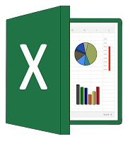
Excel:
It is a very older tool and most important tool for everybody, it is used by every analytics professionals and by many data scientists. It is the best platform for advanced analytics and also an editor for 2D data.
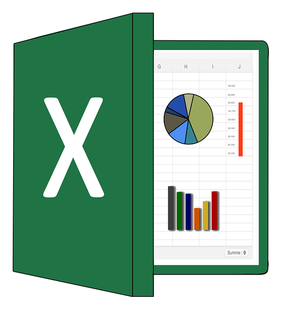
In excel everything is transparent so that you can easily track the data. In excel, we only need a key to perform the task, for example, F11 turns your excel table to a chart with authorized company id. Excel allows us to perform the various features for adding the built-in table, Filters, grouping, slicers, cell formulae, window splitting and many more. It can handle the table with a maximum of 10,48,576 numbers of rows and 16,384 columns per sheet.
Tableau:

It could be available for any desktop and online and services editions, we can share our data and dashboard with Tableau application and with open-source of Tabeau. It gives an efficient graphical representation of the data with graphs, maps, charts and bar diagrams.
Watson Analytics:
It is developed by IBM. It is a cloud-based analytical tool that provides to find out the meaningful insights from your dataset. After feeding the data to the Waston analytics it generates some questions and helps out with the answers, and we can analyze and explore the data through NLP
(Natural language processing).

It provides features such as automated predictive analysis, accessible advanced analytics, smart data discovery, simplified analysis, self-service dashboards, and provides the insights of the data.
SAS:
It is the most powerful Analytical tool for visualization, It provides an interactive dashboard, Business intelligence tool, and analytics. It is a smart analytical tool. It is capable of predictive modeling and Forecasting with its special visualization features and also easy to operate with drag and drop functions. It allows importing the data and applies basics data quality refining functions. Work efficiently with the text analytics process as gaining insight from social media and other text data, and know whether the sentiment is positive or negative. SAS is an abbreviation of Statistical analysis software.

PowerBI:
PowerBI is an open-source cloud-based business analytical tool that is developed by Microsoft that allows anyone to visualize and analyze the data with better speed. It is similar to Tableau. It is a powerful and flexible tool to analyze the variety of data and for a large amount of data.
 It is easy to use with drag and drop features and also allows to perform some task like sorting, analyzing, and comparing and these features are very easy and fast. PowerBI is compatible with various other sources that include Excel, SQL, cloud-based data repositories, and many of these reasons the data scientists use.
(Natural language processing).

It provides features such as automated predictive analysis, accessible advanced analytics, smart data discovery, simplified analysis, self-service dashboards, and provides the insights of the data.
SAS:
It is the most powerful Analytical tool for visualization, It provides an interactive dashboard, Business intelligence tool, and analytics. It is a smart analytical tool. It is capable of predictive modeling and Forecasting with its special visualization features and also easy to operate with drag and drop functions. It allows importing the data and applies basics data quality refining functions. Work efficiently with the text analytics process as gaining insight from social media and other text data, and know whether the sentiment is positive or negative. SAS is an abbreviation of Statistical analysis software.

PowerBI:
PowerBI is an open-source cloud-based business analytical tool that is developed by Microsoft that allows anyone to visualize and analyze the data with better speed. It is similar to Tableau. It is a powerful and flexible tool to analyze the variety of data and for a large amount of data.

Plot.ly

The benefits of visualization:
1. It is faster for taking actions that the human brain can easily understand the visualize information than written contents. Charts and graphs summarize the complex data.
2. After the completion of the projects, we need to submit the report in formalized documents that contains static tables and they are so elaborated that they are easy to understand.
3. Visualization allows users to track the connections between the operations and the overall business performance that is finding out the correlation between the data.
4. By using data visualization for data science it helps for monitoring key indicators, business leaders can more easily spot market shifts and trends in varied and large data sets.
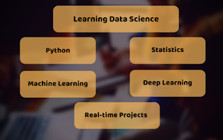
Learnbay provides industry accredited data science courses in Bangalore. We understand the conjugation of technology in the field of Data science hence we offer significant courses like Machine learning, Tensor Flow, IBM Watson, Google Cloud platform, Tableau, Hadoop, time series, R, and Python. With authentic real-time industry projects. Students will be efficient by being certified by IBM. Around hundreds of students are placed in promising companies for data science roles. Choosing Learnbay you will reach the most aspiring job of present and future.
Learnbay data science course covers Data Science with Python, Artificial Intelligence with Python, Deep Learning using Tensor-Flow. These topics are covered and co-developed with IBM.
1. It is faster for taking actions that the human brain can easily understand the visualize information than written contents. Charts and graphs summarize the complex data.
2. After the completion of the projects, we need to submit the report in formalized documents that contains static tables and they are so elaborated that they are easy to understand.
3. Visualization allows users to track the connections between the operations and the overall business performance that is finding out the correlation between the data.
4. By using data visualization for data science it helps for monitoring key indicators, business leaders can more easily spot market shifts and trends in varied and large data sets.
Learnbay provides industry accredited data science courses in Bangalore. We understand the conjugation of technology in the field of Data science hence we offer significant courses like Machine learning, Tensor Flow, IBM Watson, Google Cloud platform, Tableau, Hadoop, time series, R, and Python. With authentic real-time industry projects. Students will be efficient by being certified by IBM. Around hundreds of students are placed in promising companies for data science roles. Choosing Learnbay you will reach the most aspiring job of present and future.
Learnbay data science course covers Data Science with Python, Artificial Intelligence with Python, Deep Learning using Tensor-Flow. These topics are covered and co-developed with IBM.
Comments
Post a Comment